


When preparing your home for sale, few decisions matter more than paint color. The right shade can make a room feel brighter, larger, and more inviting—especially when paired with smart staging techniques. But here’s the catch: color never exists in isolation. Lighting—both natural and artificial—transforms how a paint color looks in each space.
In sunny Pinellas County, where homes in Clearwater, Dunedin, Safety Harbor, and across Tampa Bay boast plenty of natural light, paint colors can appear dramatically different throughout the day. A warm morning sun might bring out creamy undertones, while cool LED lighting in the evening can shift the same wall toward gray. That’s why selecting the right paint isn’t just about picking a swatch—it’s about staging with light in mind.
My Favorite Tried-and-True Staging Colors
I curated a collection of timeless paint colors that strike the balance between inviting, neutral, and versatile for staging success:
Shoji White (Sherwin-Williams SW 7042)
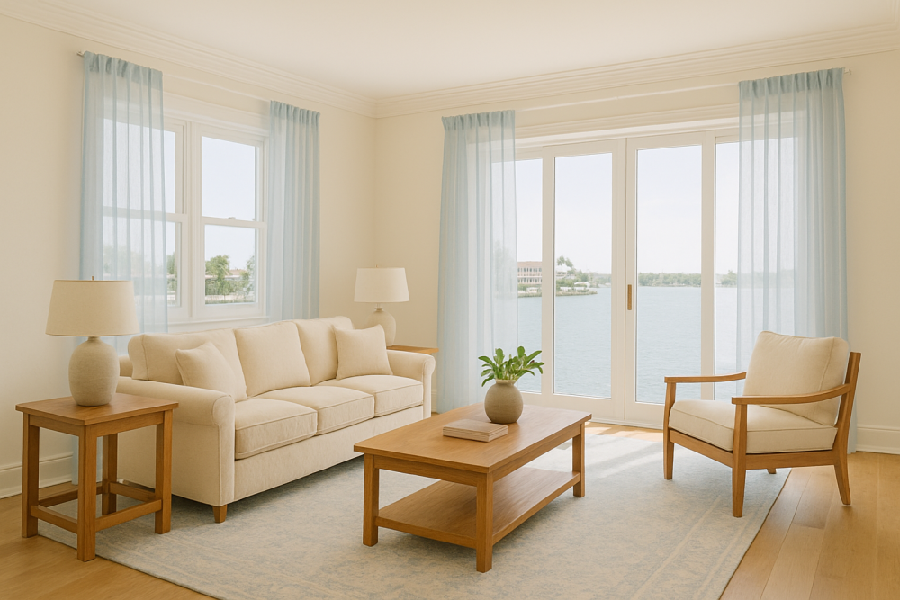
A warm, creamy white that borders on greige. Perfect when you want your space to feel light yet cozy—ideal for living rooms in Dunedin cottages or Clearwater condos.
Snowbound (Sherwin-Williams SW 7004)
This versatile cool white has a slight gray undertone, pairing beautifully with modern grays. Think of it as walking into a snowy glade—a fresh, clean backdrop that appeals to Tampa Bay buyers.
Alabaster (Sherwin-Williams SW 7008)
For homeowners who want brightness without sacrificing warmth, Alabaster is the go-to. It adds soft coziness while maintaining balance, creating peaceful interiors perfect for Safety Harbor retreats.
Westhighland White (Sherwin-Williams SW 7566)
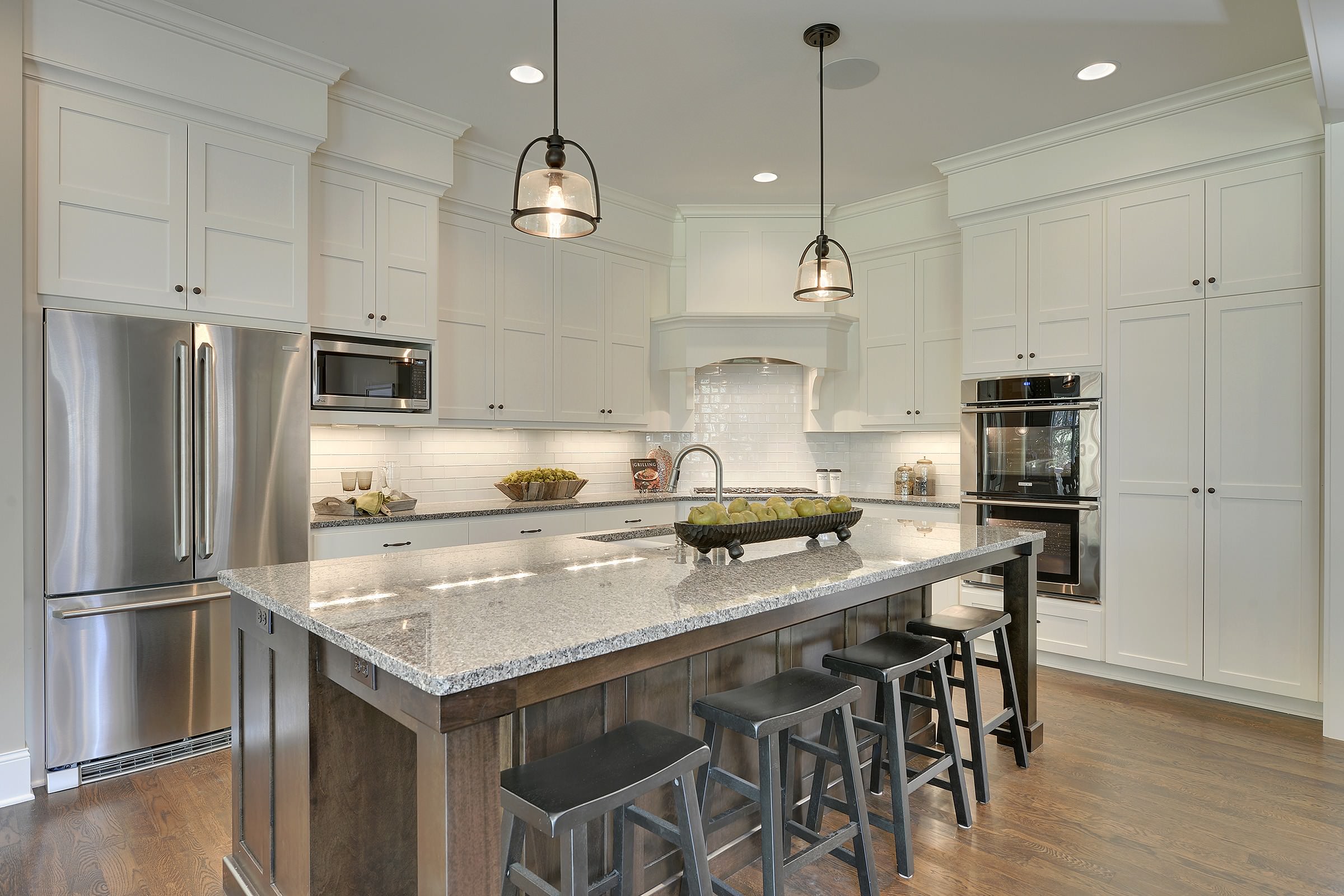
A bright, clear white with a subtle creaminess. It works beautifully for trim, cabinetry, or built-ins, making kitchens and bathrooms pop when staging your Pinellas County home.
Revere Pewter (Benjamin Moore HC-172)
Patty’s favorite greige. An iconic neutral that bridges warm and cool tones, offering flexibility across staging styles. It’s as beautiful in a modern Tampa condo as in a historic Dunedin bungalow.

Trending Neutrals for 2025
In addition to these classics, here are a couple of popular trending shades worth considering this year:
Agreeable Gray (Sherwin-Williams SW 7029): A soft, versatile greige that remains one of the most loved neutrals nationwide, blending seamlessly with coastal and modern interiors.
White Dove (Benjamin Moore OC-17): A soft, buttery white that provides the cozy vibe people are longing for after their affair with cool grays.
Classic Gray (Benjamin Moore OC-23): A barely-there warm gray that reflects light beautifully, perfect for smaller rooms where you want to maximize brightness.
Greek Villa (Sherwin-Williams SW 7551): A clean, warm white that pairs well with natural woods and soft textiles, often used in open-concept living spaces.
Pro Tips for Testing Paint Colors
One of my best pieces of advice is never commit to a paint color based on a small swatch. Instead:
1. Paint your selected color on a large poster board, leftover drywall, or order peel-and-stick samples.
2. Move the sample around your space, placing it on different walls.
3. Observe how it changes with morning light, afternoon sun, and evening bulbs.
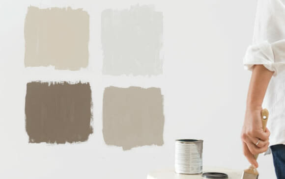
This small step saves homeowners across Tampa Bay from costly repainting—and ensures that the final look matches the staging vision.
Tools That Make Choosing Easier
Sherwin-Williams offers a free Visualizer Tool, where you can upload a photo of your room and digitally repaint it with different colors. This feature allows homeowners in Pinellas county to “test drive” shades before picking up a brush.
Why Neutrals Win in Staging
When staging a home for sale, bold colors may distract buyers. Neutrals, on the other hand, create a blank canvas where buyers can imagine their own furniture and lifestyle. In the competitive Pinellas County market, sticking with creamy whites, soft greiges, and light taupes can help homes stand out while appealing to the broadest audience.
Staging in Pinellas County and Beyond
In Clearwater, natural light from large coastal windows enhances creamy whites like Shoji or Alabaster.
In Dunedin, where historic charm meets modern updates, Revere Pewter provides a timeless neutral backdrop.
In Safety Harbor, airy colors like Snowbound help highlight waterfront views and open layouts.
Across Tampa Bay, trending neutrals make homes look move-in ready while complementing Florida’s bright, sunlit climate.
Wherever your property is located, the right color paired with thoughtful staging can make the difference between sitting on the market and selling quickly.
Color and light are inseparable partners in home staging. By choosing versatile neutrals like Shoji, Alabaster, or Revere Pewter—and testing them under real lighting conditions—you can transform any home in Pinellas County into a buyer’s dream. Combined with thoughtful staging and the right photography, these paint choices will highlight your home’s best features and boost its appeal across Tampa Bay, Clearwater, Dunedin, Safety Harbor and beyond!
🎨 Light, bright, and buyer-ready! See Clearwater and Tampa Bay homes staged with timeless neutral colors that make every room pop: https://floridahomesbypatty.com/property-search